





Dalia Forman’s Language of Color
NY Designer Brings Four Artists to CONTEXT in Miami
The New York designer and curator returns to the city where she first lived in the United States with an exhibition that brings together painting, handwoven textiles and a sculptural lamp she created with Brooklyn ceramic artist Peter Lane.
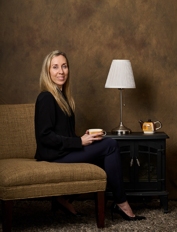
In the Buenos Aires apartment where Dalia Forman grew up, the bed went against the wall so she could see out the window. Then she found new places for the desk and the nightstand. In a 2025 profile in Argentina’s La Nación, Forman recalled how often she rearranged her family’s rooms in Barrio Norte. The view from the bed was a small discovery with a lasting implication. Moving a piece of furniture could change what a person noticed every day. Years later, in rooms she designs and exhibitions she curates, she still decides what people might see differently when familiar things change places.
Forman studied business administration at the University of Buenos Aires before moving to the United States in 2001 at age 21. Miami was her first home in the country. She later settled on Long Island, raised four children and went on to graduate with honors from the New York School of Interior Design. In 2023 she founded Dalia Forman Design, now a gallery and showroom on the Upper East Side. Working with an international network of artists and artisans across South America, the United States and Israel, Forman curates fine art, bespoke murals and wallpapers, rugs, furniture, lighting and custom installations. Those commissions put her in contact with the people who make the objects as well as the people who live with them. The showroom gives her room to consider what happens when a work moves off the gallery wall or when an object people use every day gets the space it would command in an exhibition.
That range is visible in Forman’s New York projects. She worked with a team at Salon Art + Design at the Park Avenue Armory in 2022 and served as a design partner at The Winter Show in 2026. The show featured Golden Tanger, a mural by Mercedes Costal, an Argentine design studio represented by Dalia Forman Design. At the Argentine Consulate during New York Design Week in 2024, she curated Visions of Time, a presentation of Argentine art and design. At the 2025 Hamptons Fine Art Fair, she put paintings and handmade rugs in the same presentation as a sculptural vase of her own design. Two artists from that fair, painter Marc Provisor and textile designer Carolina Pavetto, are part of her Miami exhibition.
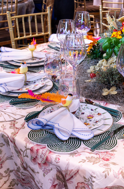
Forman’s work also finds its way to the dinner table. She created a setting for the Fund for Park Avenue’s 45th anniversary at Scully & Scully, and she has designed tables for the Lenox Hill Neighborhood House gala at Cipriani. At a dinner, the silverware and the objects on the table sit within reach for hours. They have to work at a distance of inches. That scale is an important part of her practice, even when the work is made for a fair floor.
Forman’s vase, Sartaba, gives a sense of how she works. Its shape takes a cue from a mountain above the Jordan Valley, and its alternating polished and matte steel surfaces draw on Art Deco and the finish of a set of flatware. In an interview with Muse. World, Forman described having to rethink the arrangement of the steel pieces partway through assembly. She kept the parts of the original design she liked and worked out the rest as she built it. The finished vase won silver in the 2025 NY Product Design Awards. That attention to what a material does under changing light carries into the lamp she and Lane made for Miami.
A RETURN TO MIAMI
Dalia Forman Design will present The Language of Color at CONTEXT Art Miami from December 1 through 6, 2026, during Miami Art Week. The exhibition brings together New York ceramic artist Peter Lane, contemporary Israeli painter Marc Provisor, Argentine textile designer Carolina Pavetto of Mantara and Argentine painter Néstor Neyret. The relationship between color, texture, craftsmanship and human emotion runs through the four artists’ work. Each gives color a different job. In a lamp it depends on reflection and illumination. In a tapestry it comes from dyed fibers and the depth of the pile. In a painting it can hold a composition together or set its parts against one another.
The group has a history that visitors can trace back to Forman’s New York work. Two artists return from her Hamptons presentation, and Neyret’s paintings are part of the contemporary Latin American art she shows through her gallery. Lane brings a collaboration that lets her work as a designer within an exhibition she has assembled as a curator. It also gives fairgoers a practical entry point. A lamp is an object they already know how to look at and use. Here, the surface below its shade can hold their attention as long as any of the paintings.
At the heart of the exhibition is Flourish, a sculptural lamp created through a collaboration between Dalia Forman and Peter Lane. It has a black-and-bronze patina that transforms with the changing light. By day, the base reads as a dark mass of clustered ceramic forms. When the lamp is switched on, light catches their raised edges. The bronze comes forward in patches, leaving some of the deeper recesses in shadow. The shade is simple enough to let those irregular forms carry the piece.
Based in Brooklyn, Lane is known for his monumental ceramic furniture, architectural installations and decorative works. Working from his 10,000-square-foot studio, he employs physically demanding techniques that bring out the raw character of clay. His creations have been incorporated into projects by architects and interior designers including Peter Marino, Chahan Minassian, Jamie Bush and Emily Summers. For the Hôtel de Crillon in Paris, a commission from Minassian called for a floor-to-ceiling ceramic installation. At that scale, Lane’s surfaces can change the feel of an entire room. With Flourish, a visitor can study the same kind of worked surface a few inches at a time. It is the sort of shift in scale Forman makes in her own practice, from designing a room to choosing what goes on the table.
COLOR IN PAINT AND WOOL
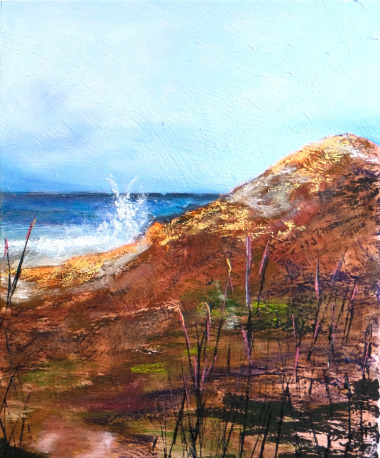
The exhibition’s exploration of color continues through the paintings of Marc Provisor, whose work draws on experiences of war and memory. Born in Philadelphia and based between Israel and New York, Provisor creates compositions that move between abstraction and recognizable forms. For Provisor, painting became a means of processing the experiences of military service, beginning during the 1982 Lebanon War when a friend gave him a watercolor set. That early encounter developed into a career spanning exhibitions in Israel, Europe and the United States. His paintings continue to explore the fragile balance between beauty and chaos.
His use of warm reds and cool blues creates a tension between urgency and calm. It is visible in One Horizon, a 2026 oil on canvas pictured in the exhibition materials. Red and pink stretch across the upper part of the canvas, while a thin band of cool blue gives the eye a place to settle near the horizon. Below it, warmer colors come back in uneven patches. The horizontal division gives the painting enough of a landscape to be recognizable, while the unsettled color keeps the eye moving across it.
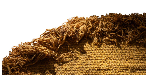
The relationship between color and cultural memory takes another form in the work of Carolina Pavetto of Mantara. Her textile creations draw on the ancestral weaving traditions of Argentina’s Santiago del Estero region. Her featured work, El color del oro (The Color of Gold), transforms sheep’s wool into a richly textured composition using the traditional Chusi cut-pile technique and natural dyes. The gold comes from the dyed wool. As the height and direction of the pile change, the yellow deepens or brightens across the piece. The folds and irregular fibers are part of the color a viewer sees.
Mantara’s approach places craftsmanship, sustainability and community at the center of the creative process. Pavetto works with artisans to preserve traditional techniques while developing contemporary designs. Forman had already shown Pavetto’s work in the Hamptons, where she spoke to La Nación about textiles that could be used as rugs or hung as tapestries. That choice changes how a person sees the work. On a wall, the weave can be studied face-on, as the surface of a painting might be. On the floor, shifts in the pile become more apparent as someone moves around the room. Bringing the wool into the same exhibition as two painters and a ceramicist lets the viewer see how much of its color comes from the way it was made.

LOOKING AGAIN
From the transformation of clay into illuminated sculpture to the color of a handwoven textile, The Language of Color gives familiar materials enough room to show how differently they behave. The deep yellow in Pavetto’s wool changes as the eye travels across the pile. The bronze in Flourish responds to the direction of the light. In the paintings, a line can divide two colors as decisively as a raised edge in clay divides two areas of light. A visitor can walk back from a painting to the lamp and try that comparison in the space of a few steps.
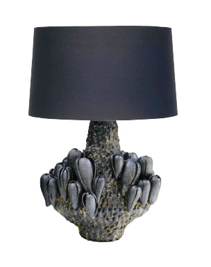
A fair encourages a quick first look. Forman’s choices make the second one worthwhile. The dark shape that reads immediately as a lamp gives way to a base made of many smaller forms. A swath of gold resolves into individual strands of wool. The distinction between seeing a work from across a room and getting close enough to understand what the maker did is one Forman has been working with since she started designing interiors. In Miami she gives visitors a reason to change where they stand and look again.
The exhibition runs December 1–6 at the CONTEXT Art Miami Pavilion, One Herald Plaza at Northeast 14th Street in downtown Miami. Public admission begins at 4 p.m. on December 1.
More information daliaforman.com · IG: @daliadebora1
CONTEXT Art Miami: www.contextartmiami.com